Jan
07
2021

Recently, we put together a proposal for a digital exhibit in which maps would play a major role. That process started a discussion here at Ideum about how we’ve created interactive maps in past projects. In just the last few years, we’ve developed numerous interactive exhibits that used maps as a way to tell stories and engage visitors. To be clear, these were not projects in which maps are primary historical artifacts, but rather experiences where we designed maps to help visitors to navigate the exhibit and explore information. Based on these experiences, we’d like to share a few thoughts about different ways of using maps effectively in digital exhibits.
Keep it Simple and Familiar
Maps can provide important context and be powerful tools for storytelling. But we also have to keep in mind that if improperly presented, visitors might see them as abstractions, creating barriers to interaction and understanding. In fact, a large percentage of Americans cannot read maps well. Many younger visitors may not have any experience with traditional maps at all, with their only exposure being maps on their smartphones. While we can certainly borrow and adapt some familiar modes of interaction found on mobile devices, large-scale digital exhibits have their own requirements that often lead to new or novel interfaces.
So how can we present maps in a way that doesn’t confuse or even intimidate visitors? First, begin with what is familiar. If there is a country, continent, or geographical feature that most visitors will recognize, incorporate it as an initial reference point. If you can animate a map from a recognizable starting point and then zoom into details, that can provide important context.
For example, few people may be able to recognize the outlines of various island chains in the Pacific. But if you start with a view of the west coast of the USA and then zoom in, many more visitors will understand what they are seeing.
Labels for country names or familiar cities or oceans can help, but labels should be used sparingly, providing just enough information to allow the visitor to understand locations and key aspects. Also, even simple design choices, like making bodies of water recognizably blue, can help orient visitors. A scale, inset maps, and (depending on the exhibit) “distance to” markers can also provide context.
We investigated all of these approaches during development of the On the Road with Bob Hope Interactive for the National World War II Museum. This exhibit documents Bob Hope’s travels across the Pacific and Europe during WWII. The distances he and his troupe of performers traveled, and their proximity to active battle areas in both theaters of the War, are important parts of the story. However, whether we are trying to show New Caledonia in the Pacific or southeastern England close up, these areas are difficult for many visitors to recognize. But if we start with a view of the United States or Europe, and then zoom into these regions, many more people can follow the narrative.
If you look at the video of the interactive, you can see the economical labeling and the zoom-in/ zoom-out animations we employed. In addition, based on the exhibit’s core narrative, we included a small inset map and the distance to Hollywood at each destination. The story is greatly enhanced as the visitors travel with Bob Hope on his USO tours, learning about each stop and the larger contributions to the war effort Hope and his companions provided.
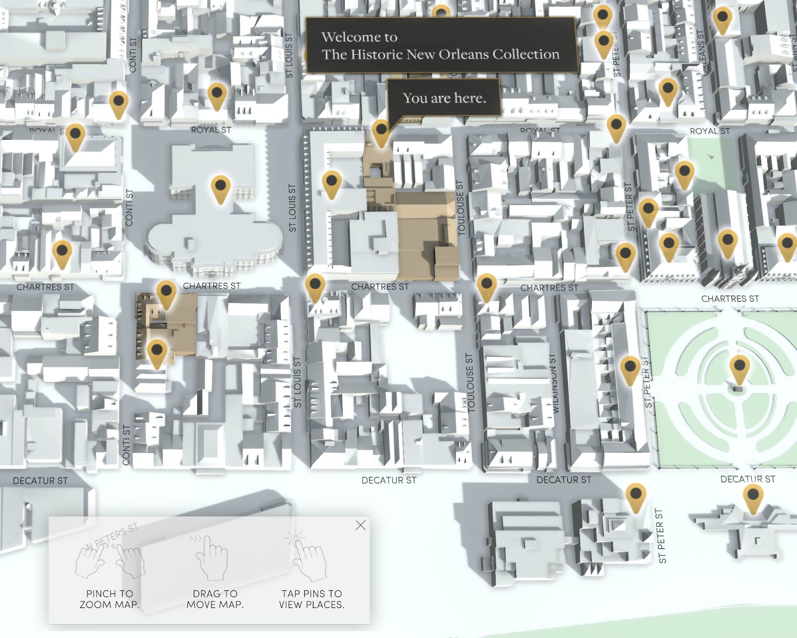
When a Map is a 3D Model
Another interesting map-based exhibit that utilized a very different approach is the French Quarter Tours interactive we developed with The Historic New Orleans Collection (THNOC). For this experience, we developed a 3D model of the French Quarter. In fact, the “collection” is the historic buildings found throughout the Quarter, so the 3D model is the map, and the map also provides the primary method for interaction, allowing multiple visitors to learn about the architecture and history of the French Quarter simultaneously.
Importantly, this interactive exhibit has a mobile companion application. Visitors can use it to select tours or points of interest from the touch table application and send them directly to an iOS or Android application to journey to the sites themselves. While we did discuss porting the table-based 3D map to the mobile application, we eventually decided that the complex 3D map would make for difficult viewing on a mobile app in a wayfinding application. Since visitors would be depending on the map for directions as they walk the Quarter, we used a more standard mobile mapping utility for that app, which includes step-by-step instructions, distances to landmarks, and other familiar conventions for mobile devices.
A Map as a Symbolic Representation
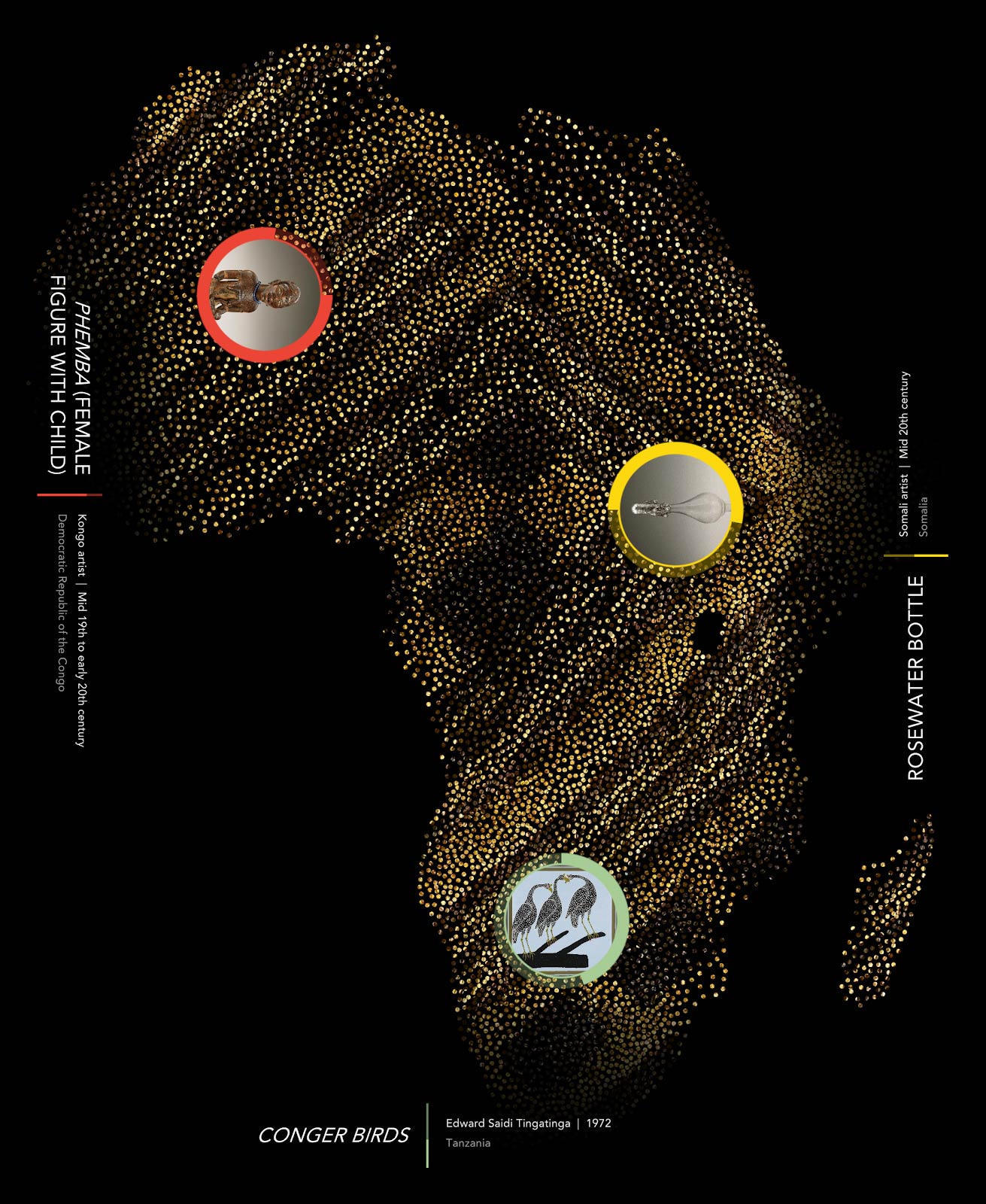
Another recent project we did with the Smithsonian National Museum of African Art uses a stylized outline of Africa as a starting point for visitors. Located in the museum entranceway, two interactive touch tables present an introduction to the museum’s collections of traditional and contemporary African art. As with the French Quarter Tours table application, the Collection Explorer allows multiple visitors to explore the collection and learn more about the continent of Africa and its culture and history.
The map of Africa in this exhibit is highly stylized and dynamically presented. Each point on the map represents an artist or community, and artworks specific to certain countries or regions emanate from their home regions. This representation of the continent is less a geography lesson than a method of suggesting that artworks in the collection originate from a diverse range of vibrant cultures, each with their own histories and artistic traditions. More aesthetically, this way of presenting the map adds color and movement to draw visitors into the experience.
Individual maps of specific regions also accompany descriptive information for each artwork shown in the experience. Similar to the animations we developed for the Bob Hope interactive, these maps are animated and start with a view of the continent and then zoom into the country of origin. In addition, these views were created programmatically, so if corrections or additions become necessary, placing the name of the country where the artwork originates will generate a new animation. The maps presented with artworks are very simple, designed to convey basic information about origin and the larger concept that Africa is a continent of many diverse nations and cultures.
Final Thoughts
Not every interactive lends itself to a map-based approach. However, for those that do, maps can provide important context and play a powerful role in the storytelling at the heart of the exhibit. Keeping it simple and making sure that the use of maps aligns with the educational goals and design intent of the exhibit (or larger exhibition) is key. While the examples provided here demonstrate that there is no “one size fits all” approach, there are a set of qualities that effective map-based exhibits present. Beginning the design process with the premise that, for some visitors, maps might appear as abstract or even unrecognizable shapes, can be a good starting point. Brainstorming ways of making maps more recognizable and easier to understand, with labels, colors, insets, animations, and other techniques, is the next step. As always, the key is being thoughtful about how maps can help guide the visitor through the narrative at the heart of the exhibit.
Finally, while evaluation and testing are important for any exhibit, it is doubly important for map-based exhibits, which can be more complex than many other approaches. Ongoing evaluation with naïve users is the best way to test assumptions and to make improvements as needed. We currently have two other map-based exhibits under development, and at least one more may be in the works. We will keep you updated and we share more thoughts about interactive mapping later this year.